Articles - Lighting Productivity
A quality lighting design in a space is achieved by applying the appropriate type of light and the appropriate quantity of light.
The primary types of light used are task, ambient and accent. The quantities used will vary, but the visual effect will result in
a balance of light and dark that will meet aesthetic and functional goals.
Accent lighting. What is it?
First a little background and some terms:
| Ambient Light | General light in the environment, either from daylight, electric light or both. |
| Accent Light | Light illuminating a point of interest or feature. It must be at least three times as bright as the ambient to be considered an accent. |
| Spot Light | Light source or fixture that focuses light in one direction (often used for accent lighting). |
| Beam Spread | How wide an area a directional light source will cover. A narrow beam spread is called, spot and a wide beam spread is called, flood. The farther the light is from the subject, the more area a given beam will illuminate; at a lower brightness. |
| Foot-candle or LUX | Quantity of light shining on an object (unit of illuminance). We see reflected light or luminance, so foot-candles alone do not describe perceived brightness. LUX is the international term. |
Our eyes define spaces by looking for differences, or contrasts, in texture, color and brightness. These characteristics (and others) combined build the picture that is our visual field.
In this article, we will overview the differences in brightness. Yet, light alone does not affect contrast. All the above conditions can impact contrast or brightness. For example, a dark surface with pictures. The lighter colored picture will appear brighter than the surroundings even though the same light level is striking the wall and the pictures.
All else being equal, the area with the most light will appear brighter (for highly polished surfaces this is not the case).
White wall: different light levels, different brightness.
Our eye is naturally drawn to areas of brightness. We perceive something or someplace as bright only in comparison to areas of less brightness. This difference is expressed as a contrast ratio. For instance, an area on the wall that is twice as bright as the surrounding area would have a 2:1 contrast ratio.
| Contrast ratio is the ratio (or relationship) between the light falling on a task or display and the general lighting in the area immediately surrounding it. |
Choosing the proper contrast ratio effects our impressions of a space or object, how well we see it, and our threshold for eye fatigue and safety. There is not any one contrast ratio that will be right for all occasions. Much time and effort has gone into the study of contrast by designers, engineers and academics to enhance the visual experience. Of course, the visual experience includes fields as diverse as retail and museum lighting, to manufacturing and air traffic control.
High contrast ratios create drama, aid in wayfinding and add visual interest. But, they can also lead to eye strain, discomfort glare and distraction. While low contrast has a uniform quality that is easy on the eyes, it can be disorienting and lack visual interest.
How can I use this information?
To change the contrast ratio, change the amount of accent or task light, or change the amount of ambient light, or change both. Here is how this works in some practical applications:
- Using a lower output task light in a work area may lead to better visibility and less long-term eye problems. If one has a bright task light on white paper with subdued ambient light, it will produce a high contrast ratio that will fatigue the eye. Try increasing the ambient light level or reducing the task light.
- Most museums need to limit the amount of light on delicate artwork to prevent fading, but they want a high contrast ratio to make the artwork standout. Typically, the ambient light is drastically reduced, which means that a small amount of accent light will have more visual impact.
- Many retail stores look for ways to make their window displays more visually interesting, but when daylight floods the area it creates a very high ambient light level that makes the displays look flat (low contrast). This can be overcome by using very focused, intense accent lights, lowering the amount of daylight, or a combination of the two.
- When entering a roadway tunnel during the day, one goes from a very bright environment into a dark environment. While the eye is adjusting to the new conditions visibility is extremely limited resulting in a serious safety issue. To aid in this transition, the first few hundred feet of the tunnel are very brightly lit, gradually stepping down to a lower level. This is an effort to minimize the contrast between the light outside and inside of the tunnel. At night, this extra lighting is usually turned off to mitigate the opposite effect.
- Watching TV or your computer screen in the dark for long periods of time fatigues the eyes. This is because one is essentially looking at a bright light against a dark background. The way to solve this problem is twofold, 1) increase the ambient light level in the field of view and 2) adjust the brightness down. Eyestrain in a movie theater is minimal because the large screen takes up a very high percentage of the field of view and to some extent that time inside the theater is limited.
Hopefully you have learned that an understanding of contrast effects more than just display lighting, and that perceived brightness is a function of the light on the object and the surroundings.
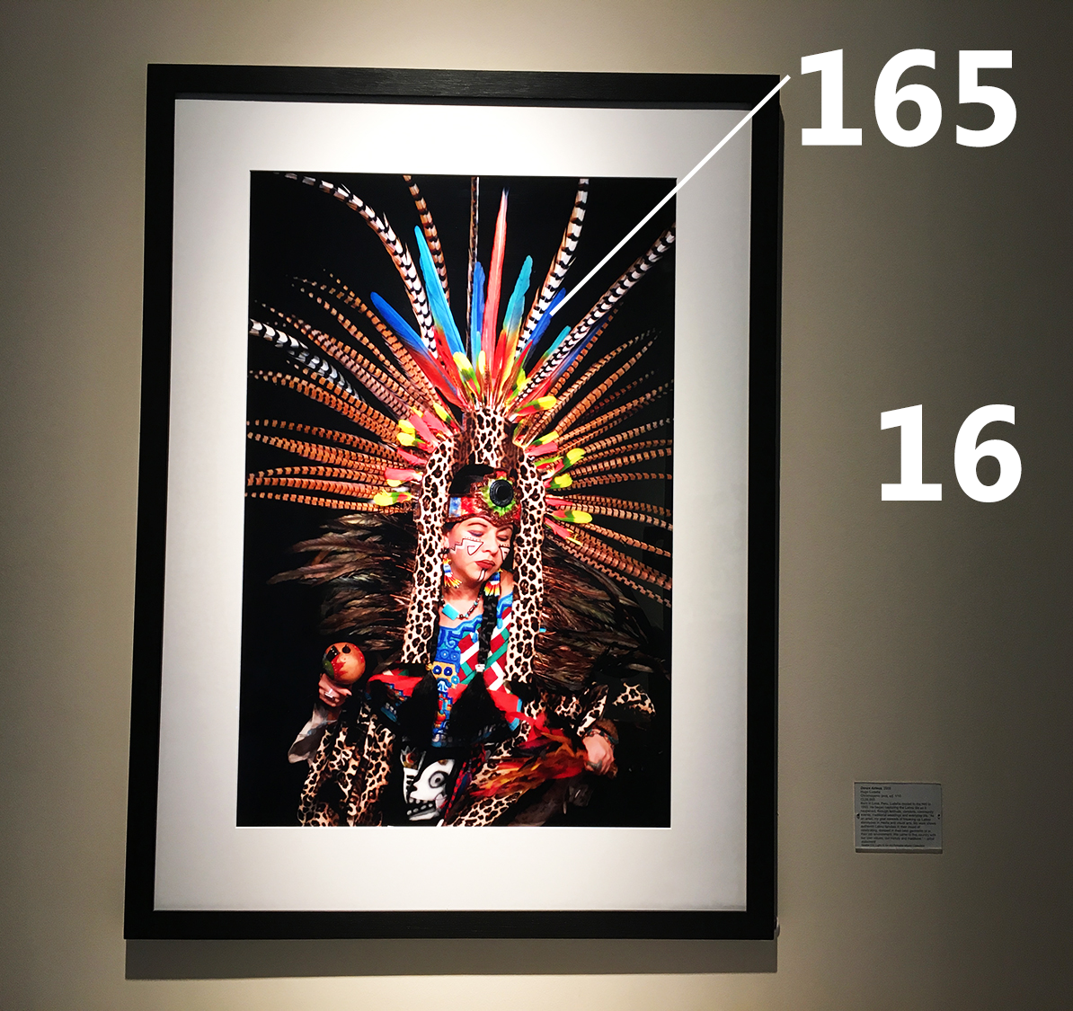
Accent lighting is mainly achieved with high contrast ratios (the ratio between the light shining on the point of interest and the ambient light).
Some common contrast ratios are:
2:1 difference can be perceived but is ‘flat’
5:1 distinct focal area
10:1 minimum for strong focal accent
15:1 dramatic focal accent.
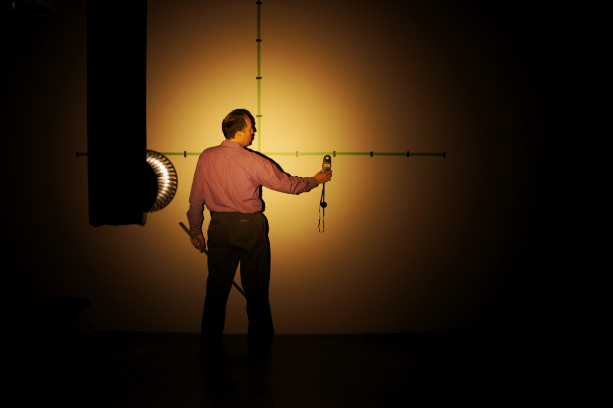
This framed photo has about a 10 to 1 contrast ratio. (Values are measured foot-candles).
#